

WOFF | OTF
This family was created/inspired from the well-known Baskerville Roman and Italic typefaces created by John Baskerville, the English font designer. We were inspired by the original family sent by Baskerville’s wife after his death.
The full Baskerville collection was bought by the French editor and author Pierre-Augustin Caron de Beaumarchais who used it to print - in Switzerland - for the first time the complete works of Voltaire (known as the “Kehl edition” from the "Imprimerie de la société littéraire typographique"). We have used this edition, with copies from 1785, to reconstruct these two genuine historical styles

One of the most widely used typefaces in the world is actually a legacy of 18th century aesthetics, representing the spirit of late Baroque design, architecture, fashion and society. It has been created and printed for millions of readers around the world for more than two and a half centuries. It influenced many modern typographers. It shaped culture, education, entertainment and science, but also the development of typography itself. As a calligrapher and technical innovator, Baskerville invented new design, papermaking and printing methods, and his typography is very natural and legible to this day. Graphic design today calls for clean and minimalistic solutions, where the use of historical typefaces can achieve a vivid contrast with contemporary elements on the page or screen. Baskerville is undoubtedly the best choice for any kind of publishing house. In keeping with the original inventor’s spirit of excellence, we hereby offer its most advanced digital version. This is not a precise remake of rare Baskerville prints or a restoration of the original punches cut by John Handy, but rather our ideal essence of transitional typography. The old masters were limited by the technology of the time, but today we can dare to have very fine lines, unlimited ligatures, size variations and sophisticated OpenType functions. Drawing, programming, proofing and testing took us many years of development and brought thousands of new letters and dozens of language options. We are convinced that your readers will enjoy this font mainly for reading extensive works, but also for creating corporate identity, orientation systems and cultural posters. Baskerville is perfectly modern in its antiquity, striking in its modesty and timeless in its transiency.

OTF
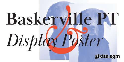
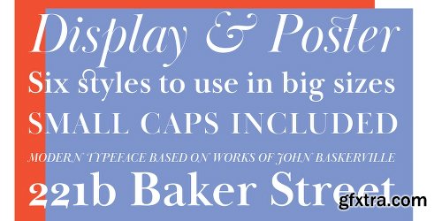
Baskerville Display PT is a type family intended for large and extra large point sizes. It was inspired by the faces of John Baskerville and designed for expressive display typography. Two weights of Baskerville Display with matching italics are much lighter than the existing text versions of Baskerville. Each of them is an ideal partner for ITC New Baskerville. A good addition to the family is Baskerville Poster which will look great in very large sizes. The font was designed by Arina Alaferdova under the supervision of Dmitry Kirsanov and released by ParaType in 2016.
Previews

Add-in for PowerPoint, Excel and Word
Power-user add-in: smart tools for PowerPoint, Excel and Word - Templates, Icons, Charts, Maps, Diagrams and more! Power-user provides you with a deep library of templates, icons, charts, maps, and diagrams for your spreadsheets and presentations. With Power-user for PowerPoint and Excel, you’ll draw the attention of your audience with stunning graphics that are sure to impress.

Perfectly Clear Complete 3.10.0.1785 Multilingual | macOS | 105 mb
Standalone & Plug-in for Adobe Photoshop and Lightroom
Built for precision. Made for beauty. Above all, you want better photos. But what if you could have better photos faster? Perfectly Clear has mastered the science of intelligent image correction - creating superior quality photos in record time, so you can get back to doing what you really love…in no time.
https://www.myfonts.com/fonts/itc/new-baskerville/
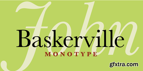
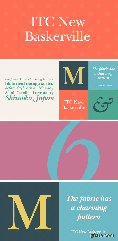
ITC New Baskerville is one of many contemporary type families based on the work of John Baskerville (1706-1775), a writing master and printer from Birmingham, England, whose types were cut by the punchcutter John Handy. Baskerville produced a masterpiece folio Bible for Cambridge University, and today, his types are considered to be fine representations of eighteenth-century rationalism and neoclassicism.
ITC New Baskerville is a late 20th-century interpretation of Baskerville’s style, designed by John Quaranda. It makes an excellent and very readable text face; its sharp, high-contrast forms make it suitable for elegant advertising settings as well.

MAX | FBX | OBJ | 3DS | C4D | LWO | MB | BLEND | STL

 F-Cell 2016 3D model")
 F-Cell 2016 3D model")
 F-Cell 2016 3D model")
 F-Cell 2016 3D model")
 F-Cell 2016 3D model")
 F-Cell 2016 3D model")
 F-Cell 2016 3D model")
MAX | FBX | OBJ
SermonBox - Seasonal Collection

SermonBox - The Series Pack Collection

Top Rated News


Would you like to be a Author?


